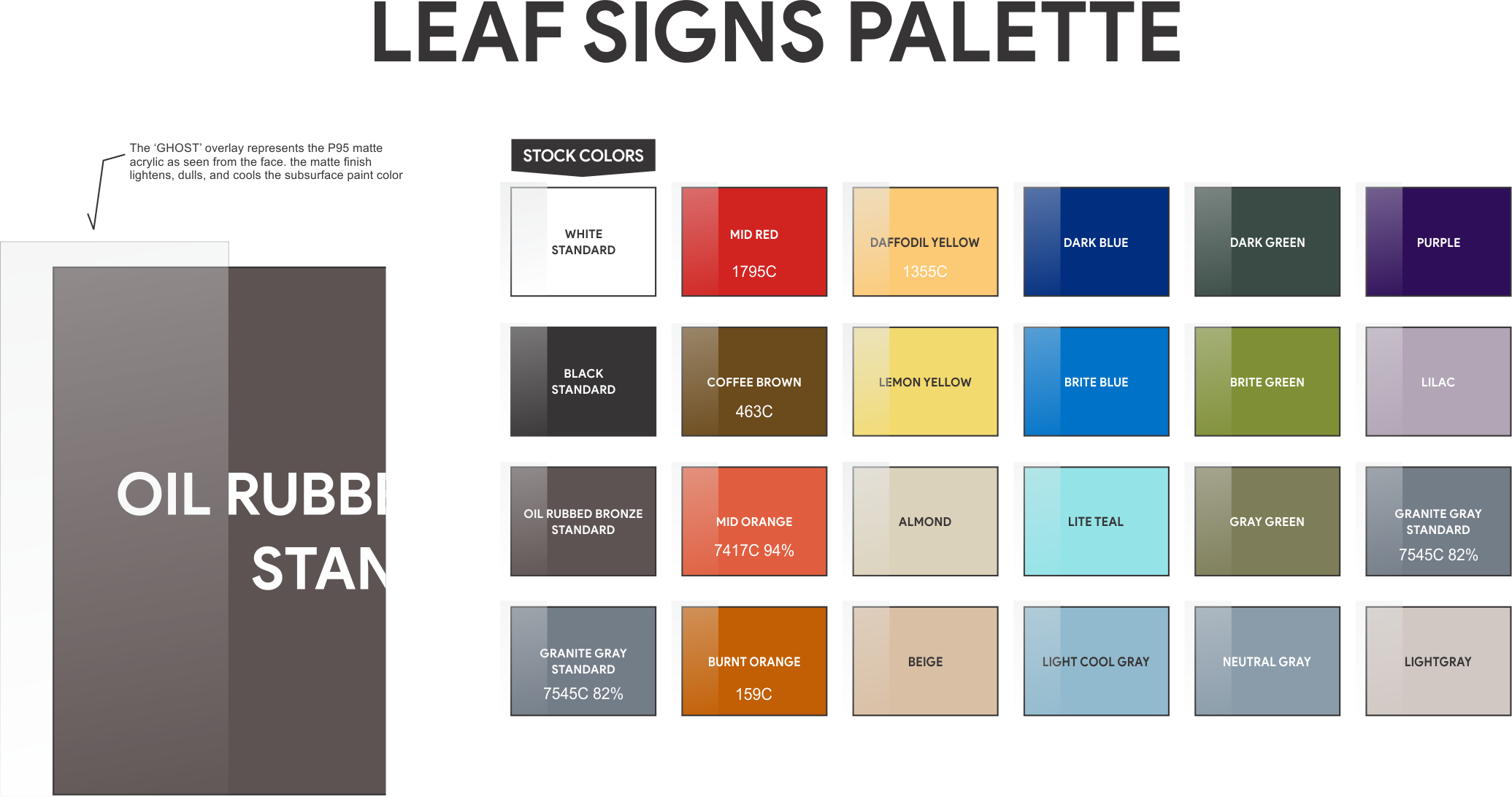
Let's talk about color and ADA
First let's talk about color and your monitor: What you are seeing is colored light. Called additive, the 3 primaries (RGB-red, green, blue) of colored light create white when mixed.
Paint is typically made of pigments, binder, and vehicle. Called subtractive color since when mixed, the 3 primaries (red, yellow, blue) create chromatic (color mixed) black. This is the method/medium we use-simply paint.
The manufacturers of plastics and laminates use a similar process for coloring their products-paints, pigments, and naturally colored materials that are in themselves colored with naturally or man made pigments or dyes.
Understanding this difference will help you arrive at a color that is realistic for production and works with your design goals and color selections.
PMS color matching: Pantone Matching System color books are standard in multiple industries. However, on close examination of the color swatches in the PMS books reveals that many of the colors were produced using halftones and translucent and/or transparent mixing colors. As with most printing, the CMYK process is used to produce the colors you see. These colors are: Cyan (translucent true blue), Magenta (translucent red/violet), Yellow (typically a transparent Hansa or Benzimidazole pigment), and black (usually a black translucent carbon pigment).
For real production of signs we need opacity. Opacity requires opaque mixing colors and/or the addition of white. White being the most opaque of pigments (particularly Titanium white). This would be another reason why color matching is just that-matching a desired color with product ( in this case acrylic or automotive paints & tinters) that has parameters that differ from colored light and the printing ink colors used in swatch booklets. Keep this information in mind when choosing and matching colors in your sign program with your logo and buildings' interior colors.
We have lots of experience with different color systems and welcome requests for design/color advice and sample production or color matching. CONTACT US for a free consultation or visit our Sign design inquiry page to let us know more about what you are looking for.

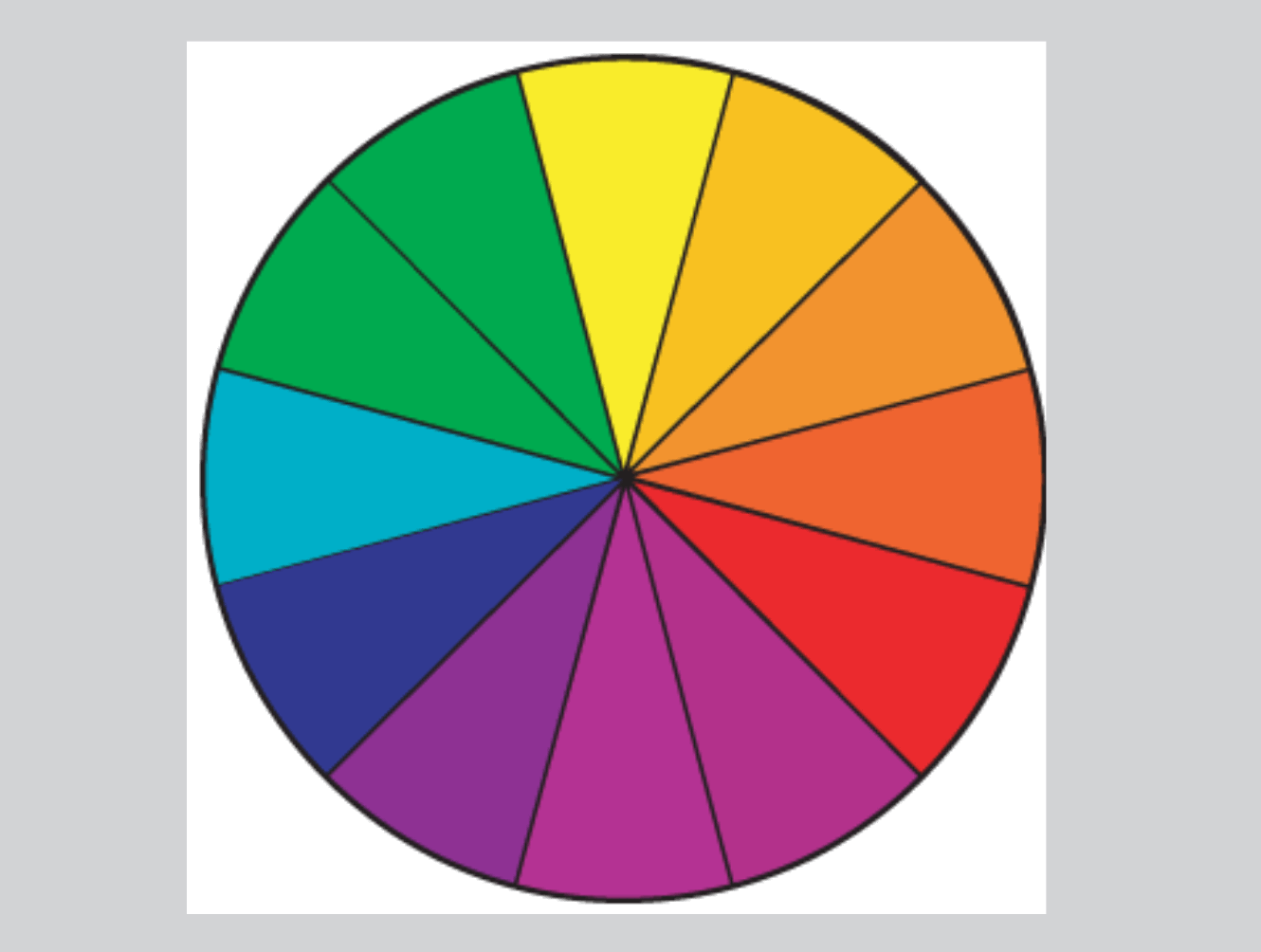
SOME COLOR BASICS:
The above diagram is a version of the COLOR WHEEL. Red , yellow, and blue are called the PRIMARIES. Primaries cannot be mixed from other colors, hence they are called primaries. The secondaries are orange, green, and violet (purple). They are made from two primaries. When a secondary, say orange, is mixed with a 3rd color not in its current mixture, in this case blue, it forms a tertiary. The closer to equal strength of the 3 colors in the mixture, the closer to black it will appear. When small amounts of the 3rd color are added to the secondary it will start to neutralize the mixture. When white is added this tertiary will appear more neutral or gray. This is how colors like Almond, Beige, and Warm or Cool Gray are mixed. Grays of course can also be mixed with black and white. When small amounts of other colors are mixed with this gray mixture it will also produce warm or cool grays.
TERTIARY COLORS (neutrals, browns, grays, etc.) along with white and black (considered neutral non-colors) form the majority of colored backgrounds of interior sign work. Metallics like brushed aluminum are also considered neutrals.
NEUTRALS (browns, grays, greige, beige, etc.) tend to stay current in regards to fashion and design trends. They blend well with more saturated colors and are generally considered good backgrounds for lettering and graphics.
The ADA AG sets parameters for contrast between the raised tactile lettering, graphics, and icons with the background color. We keep this in mind when designing your signs. For more information or help with your color scheme go to the CONTACT US or SIGN INQUIRY page.


